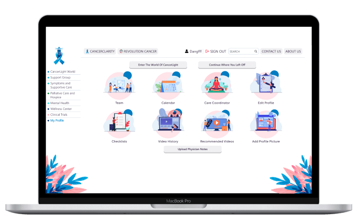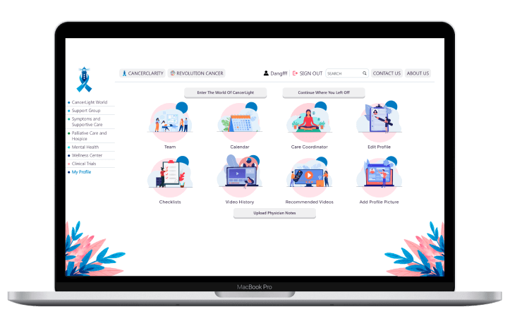

Cancer Light is an innovative application designed to empower patients and guide them through their cancer journeys with compassion and clarity. By harnessing the capabilities of the Cytoscape library, Cancer Light dynamically visualizes and presents users’ treatment pathways through interactive charts, making complex information accessible and easy to understand.
With comprehensive and up-to-date information on cancer treatments, Cancer Light empowers patients to make informed decisions about their care.
Dynamic and interactive charts visually represent users’ cancer treatment journeys, enhancing understanding and engagement.
The intuitive user interface encourages patients to actively participate in their treatment plans, fostering a sense of control and involvement.
Cancer Light embodies a compassionate initiative, offering emotional support to patients navigating their treatment journeys.
Creating an app tailored specifically for cancer patients posed several challenges. The client aimed for an application that would provide accurate, accessible information, particularly in areas where medical expertise is lacking. The primary challenges included designing an uplifting Cancer Journey Map and sourcing suitable libraries for project needs. After exploring options like D3.js, we selected Cytoscape due to its successful adoption by industry leaders like Amazon.


To effectively address these challenges, we developed targeted solutions that streamlined our development process and enhanced user experience:
We resolved varying video length issues by utilizing an S3 bucket for frontend video uploads, alleviating backend server strain.
We improved user-friendliness by setting each node’s x and y coordinates relative to its predecessor in the backend, eliminating random positioning.
Adjusted animation timing ensured smooth transitions and accurate asset placement on the map.
Streamlined Cancer Light Maps for mobile webview to resolve previous message passing issues.
We simplified user access to different trackers by integrating a comprehensive calendar feature with easy navigation.
Our commitment to user satisfaction led us to design innovative features that enhance functionality and user engagement:
Users can input their case file data to track their cancer journey and add highlights and notes.
Individual trackers allow users to monitor their symptoms, chemotherapy, medications, and radiotherapy.
A complete calendar tracks chemotherapy and radiotherapy schedules, ensuring users stay on top of their treatment plans.
Users gain knowledge and insights through a dedicated blog section filled with valuable information.
Admins maintain control over critical features like map creation and treatment records through a comprehensive admin panel.

Developing Cancer Light demanded creativity, technical expertise, and an outside-the-box approach. Our team provided the following services to craft a world-class app:


Every phase of the project was carefully executed to achieve a market-ready product:
Collaborating with the Cancer Light team to define objectives and goals.
The design team created an intuitive, user-focused interface that sets the app apart.
Building core features and functionalities while adhering to deadlines.
Conducting rigorous testing to ensure a bug-free and user-friendly app.
We utilized a modern and versatile technology stack to ensure Cancer Light offers a seamless, high-performance user experience. By combining innovative front-end and back-end technologies, we created a scalable and reliable solution tailored to user needs.
Delivering an intuitive interface that balances functionality with aesthetics.
Built a strong backend infrastructure to support app functionality.
Ensuring a flawless app experience with comprehensive testing processes.